Odds & Ends //
Not limited to digital media, design is an interdisciplinary study pulling from multiple crafts to fit the needs of the client. For me, this translates to an excuse to dabble in a variety of traditional and not so traditional crafts. This flare for experimentation helps keep work fresh, and stay up to date or even ahead of trends in design.
Web //
On Point // On point was a concept built for Appalachian State University as a training program meant to educate students, faculty, and staff on the warning signs of suicide and what steps to take in order to prevent it once identified. Based on the idea that everyone is susceptible to depression and that everyone needed to be on point to identify it, the general theme was designed to represent a broad spectrum of individuals to increase relatability.
Aspis // A tool for graphic designers just entering the field to reference and make sense of copyright law. Using the myth of Theseus and the Labyrinth as a metaphor for the complex topic, Aspis is themed with greek aesthetics
Painting //
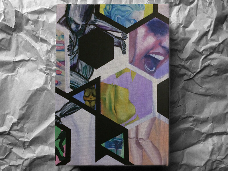
Where my creative expression manifests itself in the relatively modern realm of design, my aesthetic is inspired by a number of historic art movements, in particular, within the realm of painting. I find myself drawn the to the dream like qualities and depth of expression exhibited in such movements as surrealism, impressionism, and abstract expressionism. While my design is contained within the grid established by Bauhaus principles, such influences help me see beyond and manipulate the existing rules to reach results that are unexpected and unique.
Printmaking //
While most of my work that happens behind a keyboard, I hold onto the belief that a designer’s greatest strength is the ability to take advantage of multiple crafts and materials to create experiences unique to each client. My experience in printmaking emphasizes this belief, as I alternate between design and printmaking for results I would not be able to produce with one alone.
Typography //
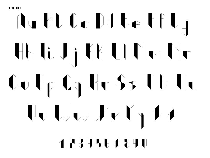
Karloff is a typeface inspired by the tension and grandeur of classical tragedy and gothic horror. Designed as a display font for posters and other promotional material for dramatic productions, its legibility is limited at smaller sizes, but at a larger scale, creates a “stage” for the more visually evocative scenes of content while creating a sense of veiled tension with its use of diagonals and sharp corners.
Glyphs //
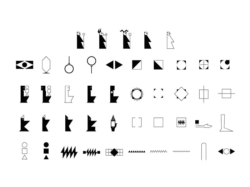
This set of icons was developed as a submission to The Phaistos Project or Forty-five Symbols initiative, and is meant to propose the concept that technology has taken on the role that ancient religion once filled. With this theme in mind, the icons are a combination of visual elements from Egyptian hieroglyphics and modern concepts of technology to form a modern hieroglyph system that illustrates our worship of technology.
Photography //
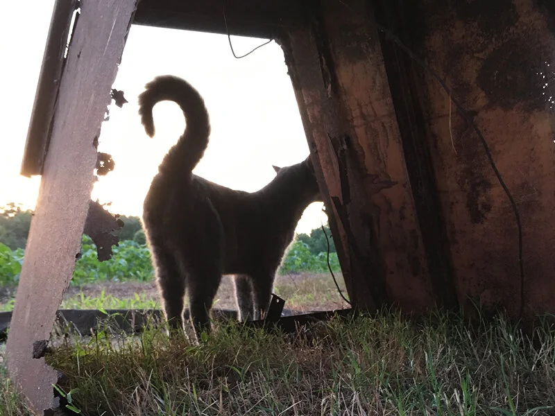
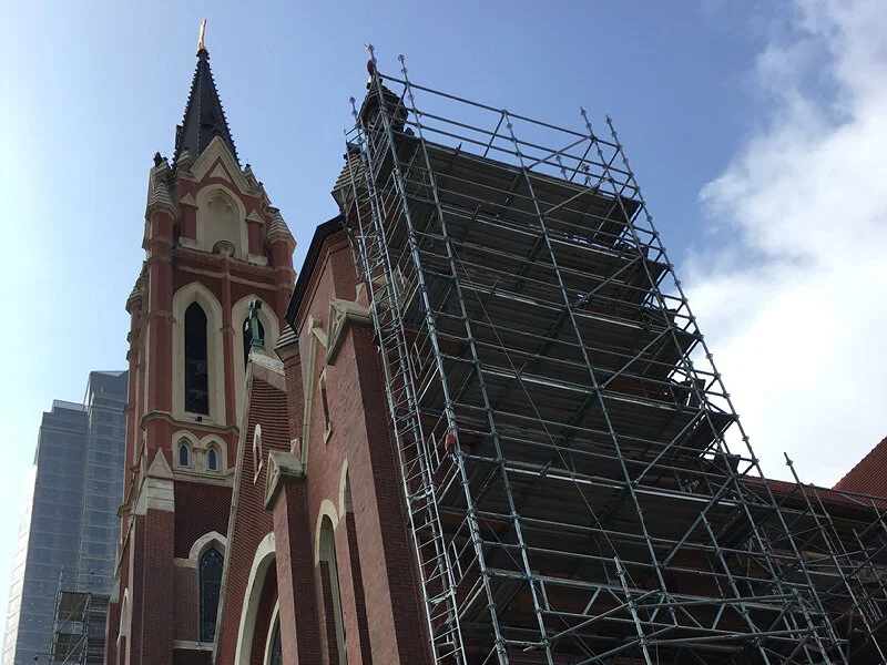
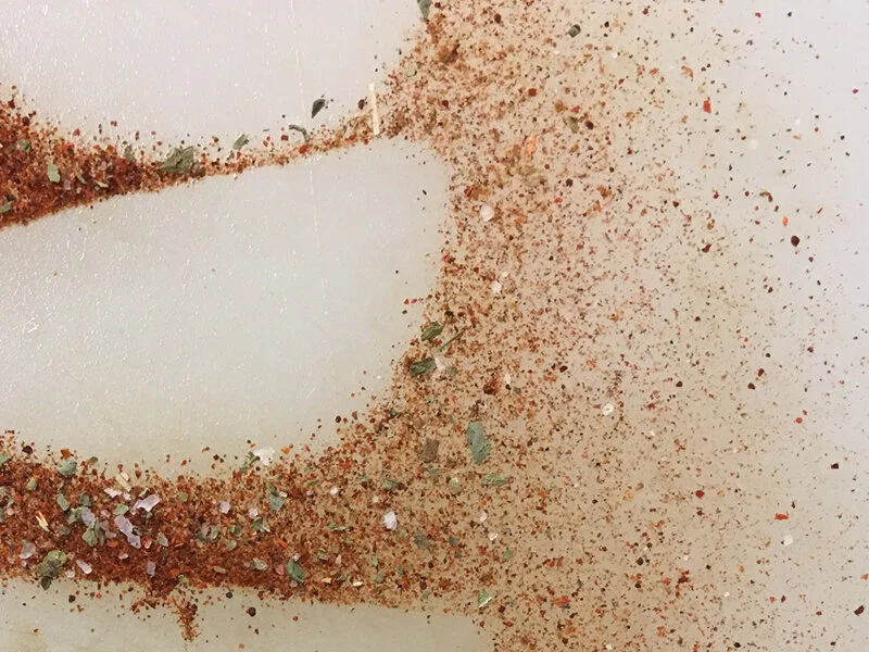
Always on the lookout for new layouts, color pallets, and textures, I find myself looking for inspiration from architecture and the environment. This has led to a series of photos the evoke new ideas in my creative process.


