Branding //
What excites me most about branding is the diversity of challenges presented from one client to another, and the process of discovery needed for truly signature solutions. Working in tandem with the client to distill their goal and tone into a logo, I also specialize in taking a brand to the next level, with experience in the production of marketing materials as well as their implementation. My philosphy of design is that every brand has a story to tell, and I relish the opportunity to communicate it in an engaging way.
Lincoln County Historical Assoc. //
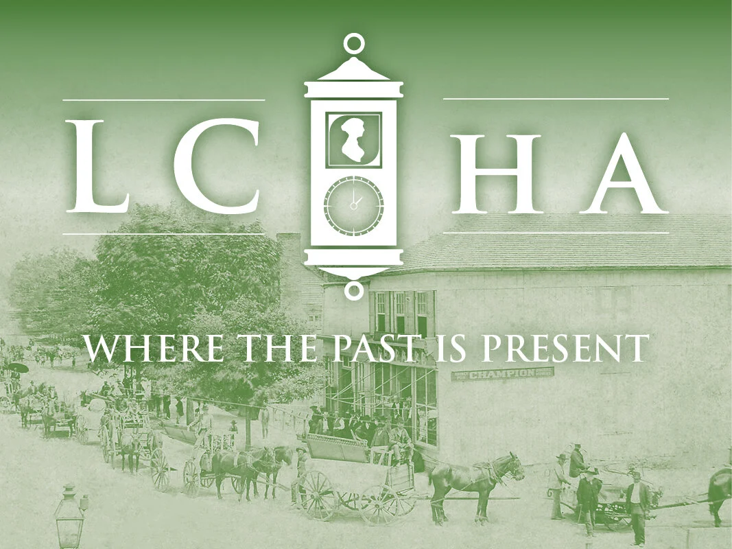
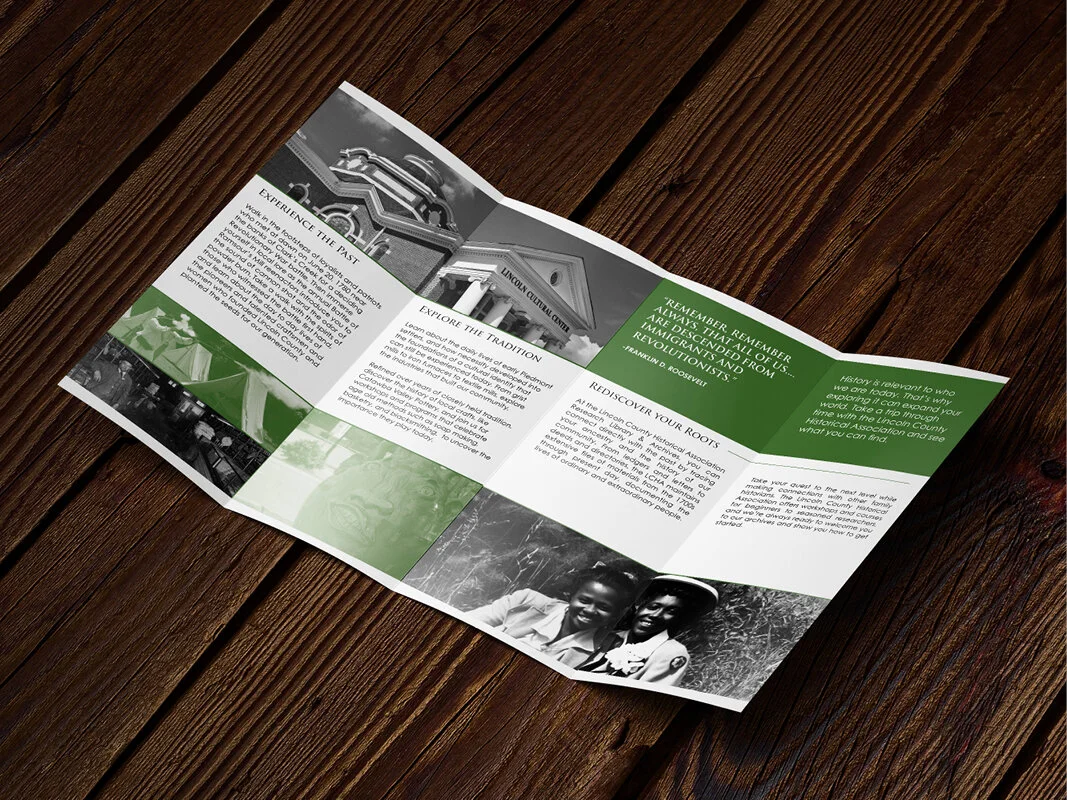
The LCHA approached me for the development of a new logo and several promotional assets to revitalize their brand. Aside from the logistics of providing new letterhead, the venture also involved the production of several public facing materials including a brochure, postcards, and a newsletter. Design was largely inspired by historically significant landmarks and archived of photos used to make the organization more relatable to the average resident as well as distinguish it from similar organizations.
Smarty Pants Trivia //
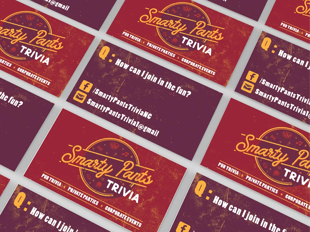
A tonally driven project, the brand for this budding entertainment service was designed to engender a sense of authenticity through the use of iconic aesthetics that leverage a sense of nostalgia from it’s audience, Fun and flexible, the logo and accompanying assets were made to easily identify what service it offered while granting space to grow and adjust as it found it’s feet.
Sandy’s Books and Boxes //
Inspired by the service provided by the client, the design of the logo is a deconstruction of either a book or box, into its essential visual element of a square and conceptual theme as a container. From this vantage, the design is meant to communicate a rationally crafted container to fill with whatever whimsy the customer can imagine.
Apple Festival //
As a part of an on-going volunteer effort in my community, I made the 2016 logo for the Lincolnton Apple Festival, and have since aided in the design and production of a range of general marketing materials and collateral. This effort has extended to the local Historical Association where I helped develop and launch their new branding initiative.
Interdisciplinary Studies //
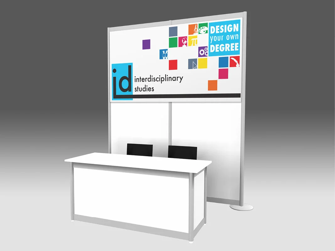
The Department of Interdisciplinary Studies approached us with the challenge of creating a logo to represent them and their unique “do-it-yourself” educational system. In response to this, we sought to make a logo based around versatility and customization.
K. Morgado :: H. Groves
Downtown Boon //
When rebranding the downtown area of Boone NC, our group was initially inspired by the quilts because of their cultural relevance to the area. Visually the geometric pattern of a quilt appealed to us, but conceptually, the what sold the idea was the theme of “one made from many,” matching the cosmopolitan culture celebrated in the downtown area. Pursuing this concept further, we ended up representing buildings from the downtown area as squares of the quilt.

